I was super excited to see that Gage featured my large Diagonal Cutters on the cover of their Faigin Atelier brochure!


I was super excited to see that Gage featured my large Diagonal Cutters on the cover of their Faigin Atelier brochure!
I attended Andy Eccleshall’s painting workshop on the weekend of December 6th at the Cole Gallery in Edmonds. Andy is an excellent landscape painter and a great instructor and I highly recommend his workshops.
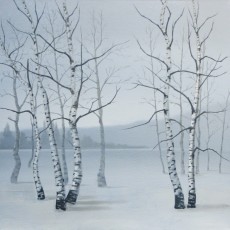
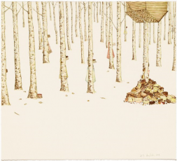
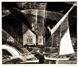
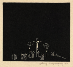
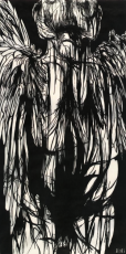
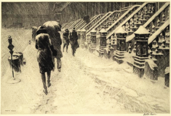
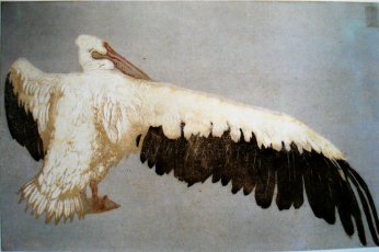
I saw an excellent print show entitled, “The Language of Prints” at the Johnson Museum of Art at Cornell University. Runs through July 27, 2014. Here are some of my favorites.
I had the opportunity to see this amazing Richard Serra sculpture at the Cantor Arts Center at Stanford University. It is called Sequence and measures 67 feet long, 42 feet wide, and 13 feet high. The sculpture is made up of gigantic plates of steel that are about two inches thick, and guests are encouraged to walk through it. Although it is a single sculpture, it seems like many because the view changes continuously as you walk through it and around, and the patterns of light and shadow change as the sun moves across the sky.
The museum has a fascinating 7-minute film showing the installation of the sculpture. Apparently it was necessary to pour a special concrete pad to hold the sculpture’s 200 ton weight. The amazing thing is that this piece is on loan. It had been displayed previously at the Los Angeles County Museum of Art from 2008 to 2011 and in 2016 it will be moved to the San Francisco Museum of Modern Art. Moving the piece involves a dozen over-sized load flatbed trucks, a team of world class riggers and a giant crane.


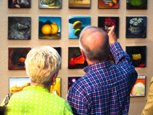
One challenge with oil paintings is that it is really hard to get a feel for the painting from a photograph. The problem is that, all too often, the photograph omits the essential characteristics of the paint that make the piece successful.
I was reminded of this fact when viewing a piece by Wayne Thiebaud the Cantor Art Center at Stanford University. It’s an oil painting called Lunch Table, produced in 1964. The painting is fairly large, about 36″ x 58″, but seems unremarkable in this image.

It is only when you step up close, that you see the piece is made from outrageously thick, voluptuous layers of glossy paint that looks like frosting. This rich paint surface is a hallmark of Wayne Thiebaud, but without seeing a closeup, one might think the work is only about geometric patterns and color and repetition.

Another day in the Atelier with three of my role models. Gary is helping Oritana reverse engineer a painting by Vincent van Gogh while Christina puts the finishing touches on her large still life with telephone.


Had a great time at the Maple Valley Arts Center’s 10-20-40 show. Each participant invited 10 guests and created 20 paintings, each selling for 40 dollars to raise money for the arts center. The place was packed, the energy was immense, and we all lingered outside under perfect Pacific Northwest skies as the sun went down. Special kudos to Christina and all the Maple Valley Arts volunteers for a fabulous event!
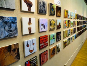
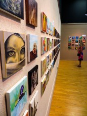
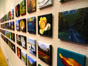
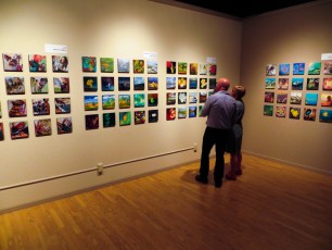
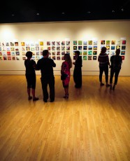
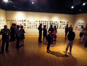
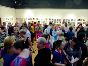
Here’s the flyer for the Maple Valley Arts show. Each artist (or in my case, group of artists) creates 20 8″ x 8″ paintings that sell for $40 each. Looking forward to seeing the walls covered with hundreds of small, inexpensive paintings.

Gary was on a roll tonight drawing and lecturing on features of the head.

Today I saw the Isamu Noguchi and Qi Baishi show at the Frye. The line and brush drawings are amazing, especially the ones that combine a large brush gesture with a fine contour drawing. Reminds me a lot of the Matisse drawings at Chapelle du Rosaire de Vence. Well worth seeing. Runs until May 25.

Isamu Noguchi. Peking Scroll Drawing: “Ye Kau Jong” (robed man, sitting cross legged, resting on fist), 1930