I’m getting much finer detail now in my SolarPlate intaglio prints. It appears the improvements come from better plate wiping technique, and adjusting my press to apply significantly more pressure.


I’m getting much finer detail now in my SolarPlate intaglio prints. It appears the improvements come from better plate wiping technique, and adjusting my press to apply significantly more pressure.
This evening I tried my first intaglio value scale with SolarPlate. My main takeaways are that the process has very high contrast, but the results are really promising.

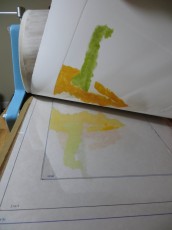
This 2″ x 4″ plate has a 10 step value scale on the left and a continuous gradient on the right.

The value scale becomes more visible once I’ve applied ink and wiped.

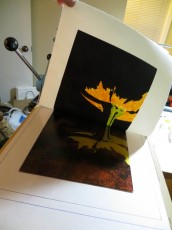
Here’s another view of the inked plate.

My goal is to reproduce the value scale on the left. The results, printed on Hosho, are on the right. It is readily apparent from this initial test that my SolarPlate process has too much contrast, compressing most of the dark end of the value scale into a couple of steps. My next test involves a more detailed test print that will allow me to create contrast adjustment curves in PhotoShop.
This evening I made an intaglio print from SolarPlate for the first time. This is the first step in working out the details of a process that will ultimately use a NuArc 26-1K platemaker to expose Imagon HD with Pictorico OHP positives created on an Epson 3880 printer. The first experiment was to determine the correct exposure and development to get a good solid black from the aquatint screen.

For this first test, I am just trying to get the correct exposure for the aquatint screen. The goal is to get an exposure and development process that gives a rich black with good edge detail. Once I get a good black from the aquatint, I can start to experiment with gray scales. This test pattern was printed with an Epson 3880 on Pictorico OHP. The central rectangle is an inch square, and the text is 12pt.

This 2″ x 2″ plate was exposed on a NuArc 26-1K Mercury platemaker. I first exposed the aquatint screen with 10 exposure units which took about a minute. Then I exposed my test pattern with 25 exposure units. I developed in water for one minute with gentle abrasion from a paint brush. The plate was blotted and then dried with a hair dryer and then exposed one more time with 25 exposure units to fully harden the photopolymer.

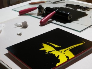
Applying Akua Intaglio with a small piece of cardboard.

Here’s what the plate looked like after wiping with tarlatan cloth and then newsprint. I didn’t realize it at the time, but the region with the white letters on black actually needed more wiping.

Here’s my first intaglio print from SolarPlate. The paper is wet Rising Stonehenge. The impression is nice for a first try, but the plate had too much ink. This resulted in solid black rectangles where the white letters should be and too much plate tone. I printed a second piece of paper off the same plate without reapplying ink and got a decent print.

This print is on a dry piece of Hosho. I wiped the plate a bit more carefully, and this improved the print quality.

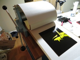
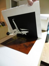
This photo shows the test pattern on the left, wet and dry Stonehenge in the center, and dry Hosho on the right. Overall, pretty satisfactory results for my first stab at intaglio with SolarPlate. I want to continue experimenting with exposure, inking, wiping, paper types, moisture levels, and roller pressures until I can reliably reproduce details down to a quarter point. Then I will start to work on gray levels.

SolarPlate relief print. 8″ x 10″ plate on 12″ x 14″ Hosho. Akua Intaglio Mars Black.
This weekend I finished the final of nine plates from my Less Is More series of black and white notan studies of pumpkins and pears. Your can see the entire collection of prints here.
I’ve reworked the second pear from the left and am still not happy with it, so I might make this plate one more time. If I do this, I will probably thin out the white outline on the right side of the leftmost pear. I really like the rightmost pear – both the shape of its stem and the shadow cast by the second pear.
This weekend I finally had a chance to print my new relief plates. Overall I pulled about 25 prints over the course of the evening. For each print I made a test print on newsprint, followed by a proof on Masa, and then a good print on Hosho.
The total includes a number of redos after boo boos. It turns out there are a million ways to mess up a print. It really helps to get a good process that you follow every time to reduce the chance of mistakes. Here is what I do
It sounds like a lot, but after a while you get in a rhythm and things go smoothly. Here are some photos.

Here are my seven brand new relief plates, ready to print.

For these prints, I want perfect contours and clean whites. I try to be very careful not to get any ink in the whites, but a little bit always makes its way on the plate, sometimes because I am rolling too fast with too much ink and other times just because it feels like it. I find it is helpful to fold a newsprint tortillon to wipe up the stray dots of ink.

I may be a perfectionist or I may need more practice rolling ink onto the plate, but currently I spend about 20 minutes per print on inking, detailing, and printing.

This plate has been inked and detailed. It is ready to move to the press. Note that the plate is sitting on top of a magnetic block that holds it up off the table so that I can roll ink all the way to the edges without making a mess.

I’ve placed this plate onto the bed of the printing press. The plate sites on a piece of protective mylar that covers a template that helps me position the paper on top of the plate. The template has markings for the plate and for the two paper sizes I am using.

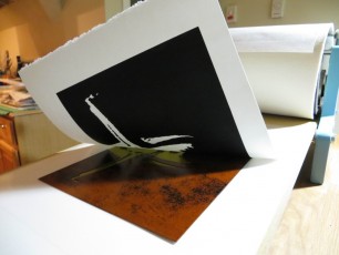
Lifting an almost perfect impression off the press!

Another great looking print!

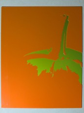
A large version of the three pears. This plate has always been hard to ink.

I’ve finished the run and all that remains is cleanup. The large pile of paper scraps is the result of detailing about 25 inked plates.
I found a really great way to make SolarPlate relief plates using paper stencils. For weeks I had been trying to develop a process that would allow me to make really crisp and clean relief plates with fine details. After many weeks of experimentation, I had managed to make a couple of excellent plates from negatives made out of glass covered with black adhesive vinyl. These negatives worked because the flat nature of the glass ensured perfect contact with the plate during exposure and the opaque black vinyl on the clear glass gave me super-high contrast.
While I was thrilled to be able to make these plates, I was a little disappointed because the process was complex and expensive and required lots of time with my mind outside of the artistic space as I scanned my artwork, adjusted it in Photoshop, converted edges to vectors in Illustrator, cut the vinyl with a Silhouette craft cutting machine, and transferred the vinyl to glass using special adhesive transfer paper. The plates were beautiful, but I felt like a technician and the process was stressful and riddled with opportunities for failure at every step.
My breakthrough came while touring the Nikki McClure exhibit at the Bellevue Arts Museum. Nikki specializes in papercut and the gallery was full of these beautiful, intricate works that looked just like prints, but were each cut from a single sheet of black paper. I realized that afternoon that I could dispense with the scanner, computer, and craft cutter if I picked up an X-ACTO knife and cut the paper by hand.
It wasn’t until I made my first plate from a paper stencil that I understood the true benefits of the approach. The paper stencils are great for reducing costs, but the approach really shines because it keeps me in the artistic space the entire time and the simplicity and fluidity of the process allows me to rapidly try out ideas and visualize the results as I go.
The reason it works so well is that paper is easy to cut and as I cut the negative I get a paper positive which gives me a pretty good idea of what the print will look like as I am working. I can easily rework an area or even cut a new piece if I make a mistake. With no risk of destroying the plate, I am free to try out different compositions, edge contours, and cutting styles – you name it – I can try it quickly and easily.
Then, once I get something I am really happy with, I can make a plate and I get to keep the positive to hang on the wall. The prints from the plate are hand-made original artist prints, but now I have this even more original, hand-made master stencil to admire. I also have the satisfaction of knowing that the entire process involved my direct touch instead of the cold hand of a computer.
An added benefit is that I don’t have to paint the original artwork. Don’t get me wrong – I really enjoy painting, but much of the emphasis in relief printmaking is on the edges of the shapes – not the interiors. When painting a flat image in gouache, some of the time goes into the edge work, but a lot of it is spent massing in the shapes. When cutting a paper stencil, you only pay for the edges and you get the masses of the shapes for free.
I think this approach has huge potential for learning design for printmaking – it teaches simplification and you can use it to prototype a multi-plate color print before going to the time and expense of creating the plates. Even if you are working in linoleum or wood block, it is nice to try out an intricate idea before committing.

The first step is draw the image directly on black paper or copy it with transfer paper. I use a white chalk pencil or white transfer paper because it is easy to see, but graphite transfer paper has the advantage of not being as visible in case you want to clean up the positive stencil to save as another piece of original art. I used Strathmore Artagain paper because it is thin, making it easy to cut and smooth enough to give good contact with the plate during exposure.

I use an X-ACTO knife to cut the stencil. This photo shows a knife that tightens at the bottom near the blade. The Gripster version of the knife that tightens at the top is much better for this sort of work because the blade won’t unscrew as the knife goes around sharp curves.

Cutting the stencil is a two-for-one proposition since you get the parts to make two stencils – one negative, and the other positive. The negative stencil is used to expose the plate. The positive stencil gives you a realtime preview of the final printed image, allowing you to make creative decisions as you cut. In the end you get a printing plate and a one-of-a-kind stencil suitable for framing.

Once the stencil is cut, the negative portions are glued to a piece of glass using a gluestick. It is important to use a piece of glass that is slightly larger than your plate so that the edges of the glass don’t cast shadows on the plate during exposure. I use glass from inexpensive 8.5″ x 11″ document frames. You can get these frames for about $3 at places like Walmart.

Another benefit of paper stencils is that you can recut individual portions of the negative if you make a mistake or just want to try another idea.

The last step is to expose and develop the plate. The stencil is perfectly flat and very high contrast, so it is easy to get a perfect exposure. Be sure that the paper-side of the glass is in contact with the plate during exposure.
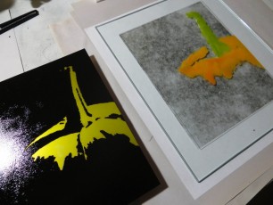
I couldn’t resist trying some other printmaking techniques with my freshly minted plate. This print uses chine-collé to add color to a black and white print. To make this print, I first cut a pumpkin body and stem out of orange and green Thai Unryu paper. I moistened the colored papers and sprinkled them with wheat paste powder and then placed them on a freshly inked plate. When I ran the plate through the press, the colored paper was laminated in place and then overprinted with black all in one step. The process worked great, but I didn’t like the results with this particular plate because it was designed for black and white with lots of lost edges. The colors made the lost edges found and the print lost some of its appeal. Still, I will file this technique away for another print.

Many people using Solarplate create negatives on transparencies using an inkjet or laser printer. This approach works well for intaglio plates which don’t require a high contrast negative, but it has some drawbacks – the artwork must be created or scanned and fixed up on the computer before printing and you need a high quality printer and lots of expensive ink cartridges.
My notans have large areas of solid black, so they more naturally lend themselves to relief printing where the raised portions are inked with a roller and the valleys remain clear. SolarPlate works well for relief printing, but the platemaking process is different because it is essential that all of the photopolymer wash away from the white regions without losing any photopolymer in the black regions. This is important because the photopolymer layer is really thin – typically less than 1mm. Any loss in the relief between the ink bearing plateaus and the white valleys will make it hard to apply the ink to the plateaus without getting it in the valleys.
The key to creating a great relief plate is contrast. To make a plate where the blacks are fully exposed and hardened while the white regions soft enough to dissolve all the way down to bare metal requires a high contrast negative.
I found that my low end Canon IP90v printer was unable to create negatives with sufficient contrast because its black ink is not opaque. If I hold the transparency up to a light, the blacks appear as weak grays. The result is a plate with pitting in the blacks.

This plate was made with a low contrast negative. When rinsing the white areas down to bare metal I got a lot of pitting in the blacks which weren’t fully exposed.
I switched to painting the negatives by hand using either gouache or India ink on vellum. This approach produced negatives with reasonable contrast, but the plate actually picked up the texture of the unpainted vellum. The texture wasn’t really a problem since it was subtle and only appeared in the raised portions of the plate where it actually helped to hold the ink.

The vellum used for this plate was translucent had a fairly coarse grain that showed up on the plate. Notice how the pattern in the grain reveals the wrinkles in the vellum.
The bigger problem was that on the larger plates, the gouache tended to cause the vellum to wrinkle and warp and this led to a poor reproduction because the vellum wouldn’t stay in contact with the plate during exposure.

This vellum negative wrinkled because of the large expanse of black gouache. Vellum doesn’t seem to wrinkle if the black regions are small. I was able to successfully make a similar negative for a 5×7″ plate, but when I scaled it up to 8×10″, the wrinkles got out of control.

This plate was made from a vellum negative that was warped and wrinkled due to the water in gouache. Notice the ghost images in some areas that were out of focus and didn’t dissolve down to the metal.
I attempted to solve this problem by painting my negatives on materials like mylar and glass which don’t warp, but I wasn’t able to acheive sufficient contrast, even with gouache. It seems that the fibers of the vellum will wick up paint and ink, making a good solid black. The mylar and glass aren’t absorbant, so they don’t hold a very opaque black. I also found that the dried gouache tended to flake off of the mylar.
I had my first success with the larger, 8×10″ plates using a black adhesive vinyl stencil affixed to a sheet of glass. The black adhesive vinyl is completely opaque and the glass is clear and flat. The process I used was to paint a positive image with gouache on Bristol, then scan it, negate it in PhotoShop, then convert to outlines in Illustrator, then cut a vinyl stencil with a Silhouette craft cutting machine.

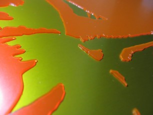
Adhesive vinyl on glass gave me a plate that was perfectly flat with very high contrast.
The process produced beautiful plates, but it was very time consuming and expensive and I felt removed from the artistic process as I spent most of my time messing around with pixels in PhotoShop and teasing the Silhouette machine to cut fine detail without jamming.
I’m glad that I now have a solid understanding of the factors that drive the quality of a relief plate and my hope is that I can use this knowledge to come up with a simpler, more artistic platemaking process.
After many failed attempts and much experimentation, I was finally able to make my first really good 8×10 relief plate using SolarPlate. Leading up to the holidays, I had been working on smaller, 5×7 plates and was getting decent, but not great results for holiday cards. I finally bailed on the hand-made holiday card idea and went with VistaPrint, thus freeing me up to focus again on the larger, 8×10 prints.
I quickly found that the larger, 8×10 prints are a whole different ballgame and the process is much less forgiving. All of the small flaws that I could get away with in the 5×7 plates compounded into utter failures in the larger plates. It took me about three weeks of experimentation, using all of my free time to figure out how to make the plate shown below. It isn’t flawless but is pretty good – stay tuned for another post explaining how I made the plate and the dead ends along the way.
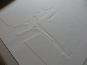
In the meantime, feast your eyes on the beautiful embossing and the rich black ink and the crisp crisp edges. After weeks lost at sea, all is well again in my humble printmaking studio.