March 6, 2016

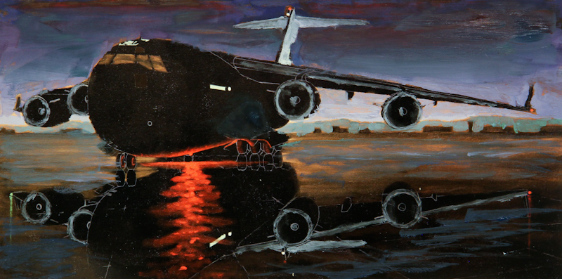
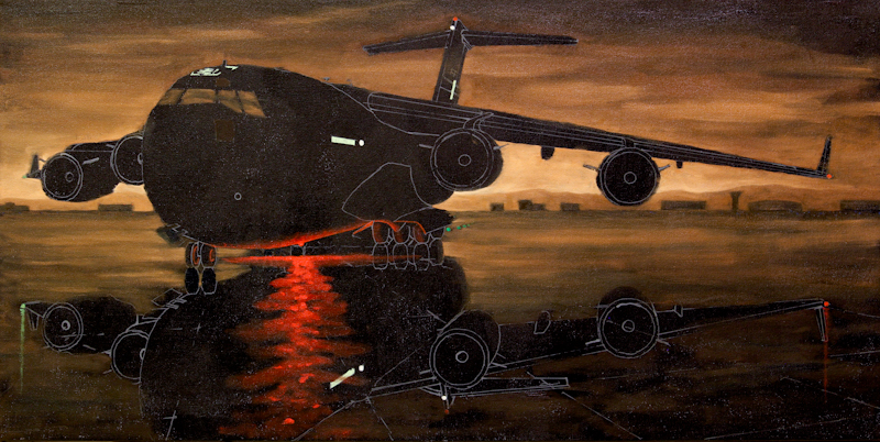
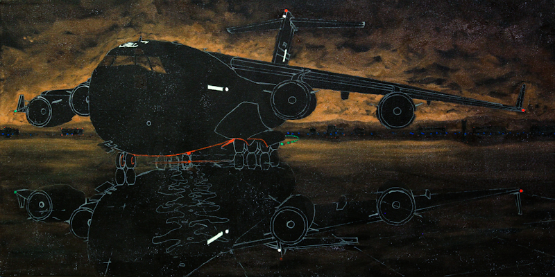
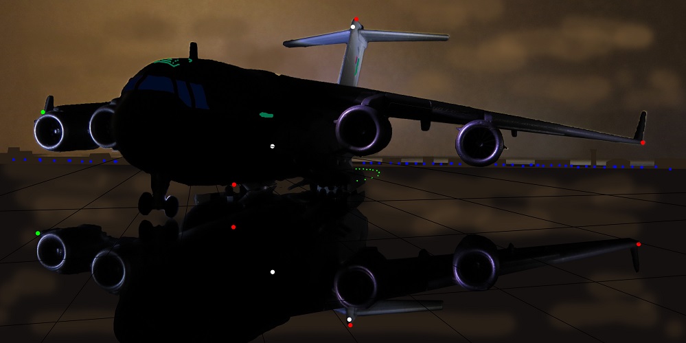
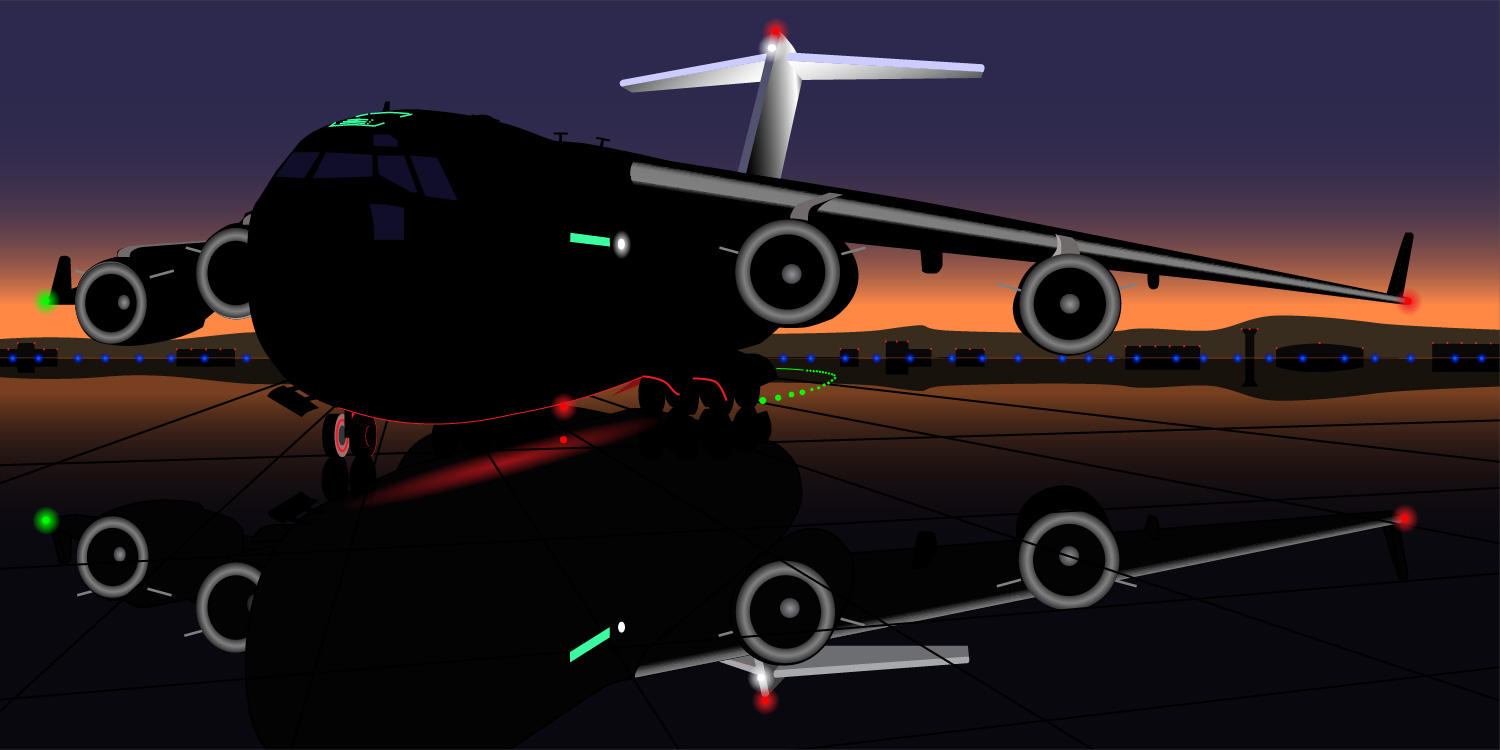
This evening I updated the sky and the tarmac to look like the study and I painted the light washing over the vertical stabilizer. The illuminated vertical stabilizer is important because it allows me to use a very light salmon near the horizon and still have the painting read as a nocturne. When painting a nocturne, one constantly has to use tricks like this to avoid a dark painting.

Before starting, I mixed three strings of Winsor & Newton Artisan Water Mixable Oil Colors. The first string was a salmon color consisting of Burnt Sienna and Cadmium Yellow Pale Hue (Hansa Yellow), lightened with Titanium White and darkened with Burnt Umber. The second was a pastel violet consisting of French Ultramarine, Cadmium Red Hue (Naphthol Red), and Titanium White. The third string was a cool green consisting of French Ultramarine, Cadmium Yellow Pale, and Titanium White.

IMG_6981

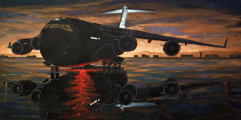
The sky is salmon and violet with a few dabs of pure French Ultramarine in the corners. Since I was painting the new colors over the previous, monochromatic sky, I started by painting the clouds with the salmon, then worked the violet into the darker regions in between. If I do a bigger version of this painting, I will start the sky with a smooth violet gradient and then work in the salmon clouds wet on wet. This will be much easier and look just as good.

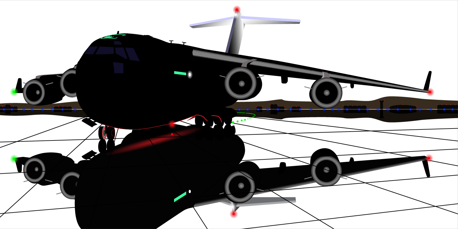
The tarmac is broken color using the dark end of all three strings plus a mixture of French Ultramarine and Prussian Blue for the darkest puddles. I spent quite a while with three brushes in my hand, carefully bringing the value up as much as possible in order to make the reflection of the dark fuselage show.

I used the light end of the green string for the vertical stabilizer. My next pass will take the bottom of the tail almost up to pure white.

The next session should bring in the highlights on the leading edge of the wing and the engine nacelles.

February 28, 2016

I spent the evening doing color studies for the C-17, painted directly on 5″ x 10″ photographs of the larger painting. Here’s the photo before any paint has been applied. At this point, I was concerned that the image may be too monochromatic.

The original image.

The original image.

First I tried making the sky dark blue, but it just didn’t look right. The painting had lost the moody feeling along with all of the interesting clouds in the sky. I did like the glowing green cockpit lights, but they came at a cost – the windows were no longer unified with the sky.

Dark blue sky and glowing green cockpit.

Dark blue sky and glowing green cockpit.

I wanted to retain the moody feeling of a stormy industrial sky at midnight, so for my second attempt, I introduced broken green and purple in the sky. This was a bit more successful than the blue sky, but the change that really made a difference was illuminating the tail and the leading edges of the wing and the engines.

Sky is broken purple/green. Tail, wing leading edge, and engines are illuminated.

Sky is broken purple/green. Tail, wing leading edge, and engines are illuminated.

Here’s the third study. This time, I tried to retain the orange clouds, while introducing violet in the sky and teal on the tarmac. This was the most successful study of the evening, but it still didn’t have the mood of the industrial night sky. Part of the problem is that orange clouds against a violet sky read as sunrise or sunset, and this works against the mood of a dark giant in the dead of night.

Sky is broken orange/violet. Tail, wing leading edge, and engines are illuminated.

Sky is broken orange/violet. Tail, wing leading edge, and engines are illuminated.

My key learnings from the studies are

  1. The sky cannot be blue because even a very dark blue will read as a clear day, just before the dawn. Purple and orange work well for post-midnight industrial sky. Next time I will try a green sky.
  2. The design is much better when the tail and wing and engines are illuminated.

February 21, 2016

Finally getting back to the C-17 nocturne after a week of travelling. This evening I lightened the sky and hills, removed the building reflections, and worked on the pool of warm red light spilling out from underneath the belly of the beast. The composition seems much stronger now that the sky is lighter. It is interesting – the sky on the horizon is nearly white but the image still reads as a nocturne.

At this point, it remains hard to visualize the final composition because I haven’t illuminated the vertical stabilizer and the leading edges of the wings and the engine nacelles. Once I have these elements in place I should be able to adjust all of the values and then start adding details.

IMG_6972-2a

February 10, 2016

Last night I finished the drawing and then spent about an hour transferring it to an 18″ x 36″ black canvas. The lines were drawn with a Montana acrylic paint marker and then I added a few color notes with a small brush and Golden Heavy Body acrylics.

IMG_6967

This evening I painted the clouds, the distant hills, the buildings, and their reflections on the wet tarmac. The painting is really rough at this stage – I’m mainly trying to figure out the value structure.

IMG_6968

The challenge is that the scene is a nocturne and needs to read as such, but I can’t allow the painting get too dark, or the composition will get lost.

February 3, 2016

This design is almost ready to paint! I worked a lot more on the reflection of the red light on underside of the fuselage, and I adjusted the sky colors and added more runway lights. I also moved the cracks in the tarmac so that they intersect the lighter parts of the plane’s reflection in more interesting ways.

C17a-7-Sunrise-01

There are a few more areas that I could improve, but I really want to start painting. The most important is the shape of the top of the tail – the C17, has a really curvaceous bulge where the horizontal stabilizers meet and it would be nice to get this into the drawing. Another area is the rudder. If I offset the rudder slightly, the silhouette of the tail will be much more interesting. Other, less important details include the markings and formation lights on the tail.

C17 Globemaster III

It’s been a while since my last post, but I’ve been busy working out a new painting design in Adobe Illustrator. This design will be the basis for a large oil painting. I started with a small plastic model of a Boeing C17 Globemaster III cargo plane that’s about 10″ long. My first goal was to come up with interesting lighting and compositions.

The small C17 model sits on a sheet of reflective acrylic.

The small C17 model sits on a sheet of reflective acrylic.

I placed the model on a sheet of clear acrylic and then photographed it in a darkened room, using bike headlamps as the only source of light. The digital camera allowed me to rapidly prototype lighting and composition ideas.

Model airplane lit with bike headlamps.

Model airplane lit with bike headlamps.

Once I settled on a composition that was promising, I put the camera onto a tripod and took a number of shots with different lighting. This allowed me to mix and match the best lighting effects from several images. At this point I used Adobe Photoshop to produce a composite image to guide me through the drawing and color studies.

Photoshop image combines best lighting passages from several photos with a hand-painted cloudy background.

Photoshop image combines best lighting passages from several photos with a hand-painted cloudy background.

My next step was to set up the plane and the composite image in front of me and produce a detailed line drawing. This was done in Adobe Illustrator. I didn’t like the shape of the nose gear and windshield on the model, so I adjusted them based on photos of the actual plane. Same for the main gear doors.

The model was also a little lopsided from a poor gluing job in the factory, so I lowered the starboard wing in the drawing and moved the number one engine (outboard, port) back underneath its pylon. I also added antennas and navigation lights. I felt it was important to include the green light on the starboard winglet, so I extended this wing a bit so that it protrudes beyond the number four engine (outboard, starboard).

Line drawing rendered in Adobe Illustrator.

Line drawing rendered in Adobe Illustrator.

Once I had the line drawing, I was able to begin experimenting with color studies. Here’s one with a dark aircraft against a bright white background.

This study with a light background really shows off the composition. I need to take care not to lose the strong lines as I darken the sky.

This study with a light background really shows off the composition. I need to take care not to lose the strong lines as I darken the sky.

The image in my mind’s eye, from the beginning, was a nocturne. Since they say it’s always darkest before the dawn, my most promising idea is daybreak. I like all the color, but I may have to lighten the sky a bit to keep the composition strong.

Color study rendered in Adobe Illustrator.

Color study rendered in Adobe Illustrator.

I will tweak the drawing a bit more and then transfer it to a black 18″ x 36″ canvas. Then I can start painting.

December 6, 2015

Finally got some time to paint again. Did the front wheel of the dump truck and most of the warm reflections. Also added an orange running light.

IMG_3642

This session I used two strings – a cool neutral for the chrome and a warm for the reflections. The cool string was based a mixture of Prussian Blue, Burnt Umber, Permanent Alizarin Crimson, and Cadmium Yellow Medium, lightened with Titanium White. The warm string consisted of varying amounts of Burnt Sienna, Cadmium Red Medium, and Cadmium Yellow Medium, mixed into the neutral string.

For this painting I’ve mainly been using Da Vinci Top Acryl brights. These are fairly stiff synthetic brushes that hold a sharp, chiseled point. They work really well with the water miscible paints, especially when I need to use a brush full of solvent (in this case water) to sharpen up an edge. The brushes are also good for modulating the tone of lighter paints on a black canvas. Since they are really stiff, I can use them to scrub the paint to allow more of the black to show through when I need a darker tone.

November 26, 2015

Happy Thanksgiving!  The cab of the truck and its reflection in the exhaust stack are now painted. Next up – probably the chrome on the front wheel of the truck and then a lot of the warmer highlights and reflections. I used a combination of Prussian Blue, Cadmium Yellow Medium, and Titanium White to give a warmer, greener blue that is slightly different from the color in the night sky.IMG_3303

More Nocturne Ideas

Here are a few promising still life ideas. Just messing around with the camera, hand-held, in a darkened room with bike headlamps.

Boeing C-17 Globemaster III, 1:200 scale diecast by Amercom.

Boeing C-17 Globemaster III, 1:200 scale diecast by Amercom.

John Deere S690 Combine, 1/32 scale diecast by ERTL.

John Deere S690 Combine, 1/32 scale diecast by ERTL.

John Deere S690 Combine, 1/32 scale diecast by ERTL.

John Deere S690 Combine, 1/32 scale diecast by ERTL.