I’m working up some new print designs. This rim-lit portrait would make an excellent linocut!


I’m working up some new print designs. This rim-lit portrait would make an excellent linocut!
Feeling inspired after a recent trip to Snoqualmie Pass. Thought I’d try a two-plate linocut – something simple, but compelling to practice multi-plate registration and the interactions between ink colors. Here’s an initial design done in Adobe Illustrator.

Here’s an update on the Keechelus print design. I’ve added more detail in the foreground and clarified the left riverbank. The silhouetted mountain ridges work well, but I’m struggling to get a more three-dimensional form along the riverbank and in the landmass on the left. I also need to make some decisions about whether to simplify or go for detail in the mass of sticks and branches in the lower right – not sure whether the details add or detract and I probably won’t know until I get some more detail in the lower left corner for balance. I’ve also experimented with cropping – using a panoramic format allows me to zoom in quite a bit without exceeding the width of my etching press. Can’t wait to start carving!

I’ve started working on the design for a multi-block linocut print of Lake Keechelus. For now, I am mocking it up in Adobe Illustrator so that I can get an understanding of interactions between the shapes and colors and layers. The image below shows one idea for a sunrise color scheme. This is a work in progress, and the bottom half is still at the block-in stage.

One challenge I’ve encountered with linocut prints is transferring my design to the block of linoleum. In the past I’ve used Saral and Richeson transfer papers, but I was never happy with the amount of detail that would be lost as I traced my design with a ball point pen. I’d read about ways to transfer a laser print or photocopy directly using nail polish remover or ChartPak blending markers as a solvent, but I never managed to get these methods to work, probably because the toner or the solvents have been reformulated.
Today I stumbled upon another technique which is simple, seems foolproof, and really works. The idea is to use an inkjet printer on a piece of slippery, non-absorbant paper. Since the ink doesn’t soak into the paper, it can be easily transferred onto another surface. McClain’s actually sells special paper that works this way, but it turns out you can get the same effect with freezer paper from your local supermarket. Here’s an outline of the process:

Before printing, I used spray adhesive to glue the freezer paper to a piece of regular printer paper. This adds a bit of stiffness to prevent curling and it gives the printer a bit more traction.

This is the freezer paper right after it came out of the printer. The lines are crisp and I had no problems with smearing or jamming.

I used my inexpensive Speedball baren to transfer the wet ink from the freezer paper to the linoleum.

The fine lines transferred perfectly and they seem fairly robust. I attempted to wipe away a line on the left side of the block immediately after the transfer and it only smudged a bit.
I’ve been having so much fun with the linocut prints that I pitched the idea as a family Thanksgiving activity. We all spent the afternoon listening to music, nibbling on appetizers and taking occasional breaks to carve our blocks and pull prints. I did this quick study of pears intended for a holiday card. The idea has promise, but I’m not really sold on the bits of light creeping around the right side of the middle and right pears. Next time I will do a gouache study before carving the block.
Printing notes: the proof below is actually on newsprint which performed better than the Daniel Smith Lennox paper. I went back and looked at my pumpkin print on Lennox and found that it suffered from the same problems I encountered with the pear – the ink sits high on the surface and it flows around, obscurring fine detail.

Pear Ensemble, Linocut Print, 4″ x 5″
Today I experimented with papers designed specially for block printing and had much better success.

Better paper makes a world of difference.
I used Dick Blick water soluble printing ink on five different papers. Here are the results:
Overall, it seems that thinner papers with a nappy surface work the best.

Five prints on five different papers.
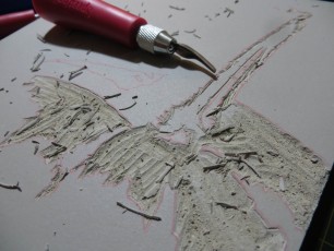
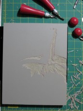
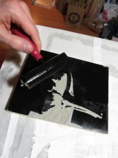
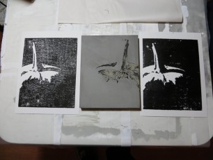
The pumpkin notans were so successful I decided to reproduce them as linoleum block prints. I haven’t done this sort of a project since elementary school, but the block cutting went well. I pulled two test prints by hand using a baren and was pretty happy with the block, but still need to sort out the ink and paper combination so that I get solid blacks. My first print showed good detail, but the ink transfer was poor. I used a lot more ink on the second print and this helped the blacks, but I lost a bit of detail. Both prints were made with Dick Blick water soluble printing ink on Strathmore 300 Bristol Vellum. I’ve heard that oil based inks work better on cotton fiber papers, and that water soluble inks are better on Japanese rice papers. I also suspect that a thinner paper would take the ink better than the Bristol.