November 8, 2015

First paint! I’m still working in acrylic, nailing down a few of the brightest brights before switching to oils for the sky. I’m trying something new with the headlights – they are light green. My plan is go over them again with a broken layer of light yellow and then again with a thick broken layer of white. The goal is to make something more interesting and realistic than a solid white rectangle. We’ll see how it goes!

Thought I was done drawing, but I ended up getting the white paint pen out to add some highlights, mostly on the rivets.

IMG_2905

Punch List Complete

After another four hours, mostly working on the loader, I finally finished the drawing for Clearing Snow! Can’t wait to get started with the paint brushes!

Completed Drawing

Completed Drawing

Here’s the punch list for the dump truck:

Punch list for the truck.

Punch list for the truck.

And here’s the punch list for the loader:

Punch list for the loader.

Punch list for the loader.

As I mentioned in my previous post, the entire drawing was done with Montana Acrylic Paint Markers. I was planning to use a waxy Prismacolor pencil, but found that it just wouldn’t write on the slippery Mars Black acrylic ground. I tried the Montana markers on a lark and really enjoyed them. They are refillable and the nibs can be replaced. I purchased a bottle of Shock Black and a bottle of Shock White and an empty mixing bottle. These bottles are nice because they are designed to neatly inject the paint into the pen, reducing the mess. The pens and the bottles also contain ball bearings and steel rods to mix the paint. For this painting I mixed up a dark gray that was just light enough to be visible, but dark enough to disappear under a thin layer of oil paint.

Montana Acrylic PAint Markers

Montana Acrylic PAint Markers

Bennington Peaches III

My first project with the new still-life stand was another Bennington Peaches study. Zip-ties hold a mirror that gives me a perfect top-down view of the peaches on the blue plate.

IMG_2126

Here’s the underpainting on an 8″ x 8″ stretched canvas.

IMG_2120

I started by covering the canvas with a random pattern of middle value acrylic colors, including French Ultramarine, Burnt Sienna, and Burnt Umber, all lightened with Titanium White. I also painted the sides of the canvas with black acrylic paint.

When this was dry, I started the oil underpainting using water miscable oils. First I established the outlines of the peaches, the plate, and the core and cast shadows using Burnt Sienna. I then painted in the shadows using a combination of Prussian Blue, Terra Verte, and Burnt Sienna. A final step was to lightened the table with a bit of Titanium White.

Portrait Study IV

Working on a iteration IV of my Portrait Study (I, II, III). 12″ x 16″ acrylic on canvas board. This time I am using a dark, cool, geometric background and warm darks for the figure. My plan is to add black lines separating the background tiles and then soften all of the edges so that they look like an out-of-focus stained glass window. I chose darker tiles behind the face to accentuate the rim-lighting and lighter teal tiles in the back to silhouette the hair.

Still very much a work in progress. I have to finish all of the tiles before I start on the hair and the rim lighting because these go on top of the tiles. I’ll probably add one more base coat to the figure before dry brushing in the form with a very dark tint of Burnt Sienna.

Montana Color Study Update

Made some more progress on my 12″ x 16″ acrylic color study for the Montana landscape. My plan is to do another pass or two over the trees and the grasses in the middle distance and then I will start on some tall green grass and a fence line in the foreground.

At this point, I have only suggested the Black Angus cows by painting the grass around them – they are basically negative space cows. It is amazing how compelling they are as just a suggestion. It will be interesting to see if I like them better or worse once they have been painted.

Overall the study is coming along well and I’m feeling optimistic about embarking on a larger, more finished piece.

North Cascades Studies

My project for the past few weeks has been studies in acrylic for the North Cascades design. I chose acrylic because I wanted to be able to move fast and still be able to create definitive edges between the light and dark regions. My first study began as an 18″ x 24″ black and white and then I experimented with a bit of French Ultramarine in the snowfield. The blue definitely helped but I wanted to do something more interesting with the trees which, at this point were just black silhouettes.

My plan is that the final image will be 36″ x 48″. With this in mind, I worked up a second 18″ x 24″ study of a crop containing trees at the final scale. As you can see, I had a lot of difficulty getting the green paint to stick. My first stroke would go down fine, but if the brush touched the paint again before it dried, the paint would lift the paint off of the canvas. After consulting some friends and a quick check of the internet, I determined that the problem was the surface of the canvas pad, which one post on WetCanvas described as “painting on waxed paper”.

I did like addition of the warmer greens and browns and the fact that the tree at the bottom no longer merges with the black background.

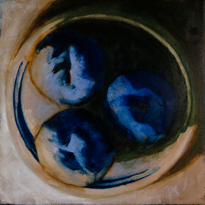
While doing the second study, I realized that a triangle of the lower left represents a rounded hill that is closer than the snowfields above. My third study attempted to differentiate these two snowfields, while doing a better job rendering the tree silhouettes. I used a bit of Prussian Blue in the background. The trees are Raw Umber, lightened in some places with Light Green (Blue Shade).

I chose these specific colors because they are some of the most opaque in the Golden Heavy Body Acrylic line. I also switched to a piece of pre-primed Dick Blick canvas which took the paint better than the Fredrix Canvas pad.

I like the direction the piece is going, but I have to work through a few more issues before starting on larger image.

The first challenge is differentiating the snowfields in the distance from the closer snowfields, without losing the magnificent contrast. The third study uses a uniform region of light blue, and this approach seems less effective than the streaks of blue in the first study. The first study really retains the brightness of the snowfields while using texture to indicate shape. I also like the color of the French Ultramarine in the first study more than the Prussian Blue in the third study.

The second challenge is differentiating the near darks from the far darks. I’d like the far darks to be cooler, but I don’t want to lighten them from Mars Black, so I plan to make the nearer darks warmer. Putting my darkest darks in the background will break all the rules of atmospheric perspective, but I think in this case it will look better. I may also need to use a warm gray to add some rounded form to the near snowfields. Whatever I do, it will be subtle.

The third challenge is to make the trees more interesting and less flat, while still retaining high contrast against the background snowfield. I will probably try painting the trees in multiples layers, going from dark to light, with the dark layer being almost black. The trees will be as light as those in the second study, but they will contain enough dark that they will really stand out against the white.

Finally, I plan to simplify the dark shapes in the distance, while adding more rocky and brushy texture to the nearer darks. Should be exciting!