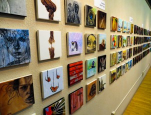
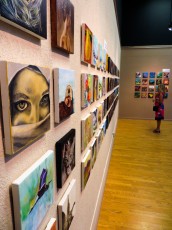
I missed the Best of Gage opening because I was out of town . . .

When I returned, I couldn’t find my painting on the wall . . .

Turns out I won second place in the Still Life category!

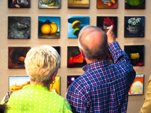
Here are the three winning entries.


I missed the Best of Gage opening because I was out of town . . .
When I returned, I couldn’t find my painting on the wall . . .
Turns out I won second place in the Still Life category!
Here are the three winning entries.
This 24″ x 24″ painting is based on a crop of my design for the Maple Valley Arts show.

Unlike the 8″ x 8″, this painting uses a modern, hard edge style. The paint is very smooth and the colored regions are all flat shaded. To get this effect, I used a mixture of Gamblin Artist Oils thinned with Neo-Megilp. My brush was a number 10 Flat, Utrecht Series 207 Blended Bristle. I found this particular brush to be stiff enough to push the paint around to make hard edges, but soft enough to smooth out most of the paint ridges in the shape interiors.
I worked from dark to light. Process shots follow.
I had the opportunity to see this amazing Richard Serra sculpture at the Cantor Arts Center at Stanford University. It is called Sequence and measures 67 feet long, 42 feet wide, and 13 feet high. The sculpture is made up of gigantic plates of steel that are about two inches thick, and guests are encouraged to walk through it. Although it is a single sculpture, it seems like many because the view changes continuously as you walk through it and around, and the patterns of light and shadow change as the sun moves across the sky.
The museum has a fascinating 7-minute film showing the installation of the sculpture. Apparently it was necessary to pour a special concrete pad to hold the sculpture’s 200 ton weight. The amazing thing is that this piece is on loan. It had been displayed previously at the Los Angeles County Museum of Art from 2008 to 2011 and in 2016 it will be moved to the San Francisco Museum of Modern Art. Moving the piece involves a dozen over-sized load flatbed trucks, a team of world class riggers and a giant crane.


One challenge with oil paintings is that it is really hard to get a feel for the painting from a photograph. The problem is that, all too often, the photograph omits the essential characteristics of the paint that make the piece successful.
I was reminded of this fact when viewing a piece by Wayne Thiebaud the Cantor Art Center at Stanford University. It’s an oil painting called Lunch Table, produced in 1964. The painting is fairly large, about 36″ x 58″, but seems unremarkable in this image.

It is only when you step up close, that you see the piece is made from outrageously thick, voluptuous layers of glossy paint that looks like frosting. This rich paint surface is a hallmark of Wayne Thiebaud, but without seeing a closeup, one might think the work is only about geometric patterns and color and repetition.

Another day in the Atelier with three of my role models. Gary is helping Oritana reverse engineer a painting by Vincent van Gogh while Christina puts the finishing touches on her large still life with telephone.


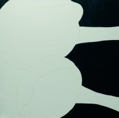
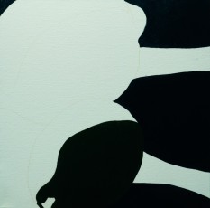
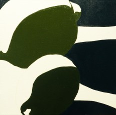
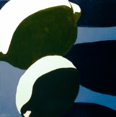
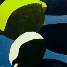
This painting started off well, but it didn’t really come together in the end. I loved the way the cast shadows faded from a deep dark blue, sharply contrasting against an impasto flecked pool of light to a soft blue haze that almost blended into the background.
My problems began when I painted the lemons and limes and they began to hover above the surface of the table. Technically speaking, the issue was that the form shadows on the fruit were much darker than their cast shadow counterparts on the tabletop. From an artistic perspective, I had failed to unify the form shadows with the cast shadows.
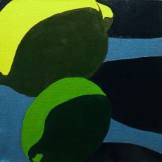
The fix was to darken the cast shadows and lighten the form shadows until the fruit appeared to rest on the table as you can see below.

I am going to declare this one done and move on.
My biggest learning from this painting is that I need to mass in unified regions of shadow, painting the shapes I see instead of the objects. In the process series below, the initial underpainting is solid because all of the shadows are unified. I got off on the wrong foot on the second step where I painted the dark blue cast shadows as entities distinct from the form shadows on the fruit. I should have painted them at the same time with the same value and, that early in the painting, even the same color.
As second learning is that Ampersand Gessobord is really different than canvas. It takes the first layer of paint very well, but then is gets extremely slippery until the first coat has dried. At this point any contact with the brush is as likely to remove paint as to add it. This isn’t a problem, but it is different, and I will need more practice if I want satisfactory results on Gessobord. For now I think I am going to focus on stretched canvas and canvas panels.
 |
 |
 |
 |
 |
 |
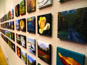
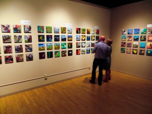
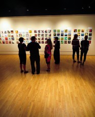
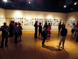
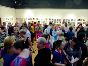
Had a great time at the Maple Valley Arts Center’s 10-20-40 show. Each participant invited 10 guests and created 20 paintings, each selling for 40 dollars to raise money for the arts center. The place was packed, the energy was immense, and we all lingered outside under perfect Pacific Northwest skies as the sun went down. Special kudos to Christina and all the Maple Valley Arts volunteers for a fabulous event!