February 6, 2014

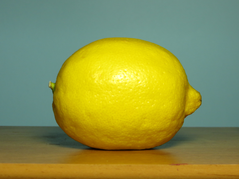
I started another lemon painting today. This time, the lemon is about double life size.

The fruit in my previous painting was too small to show the lumpy bumpy texture. For this painting, I decided to paint the lemon at about double life size so I could paint more detail.

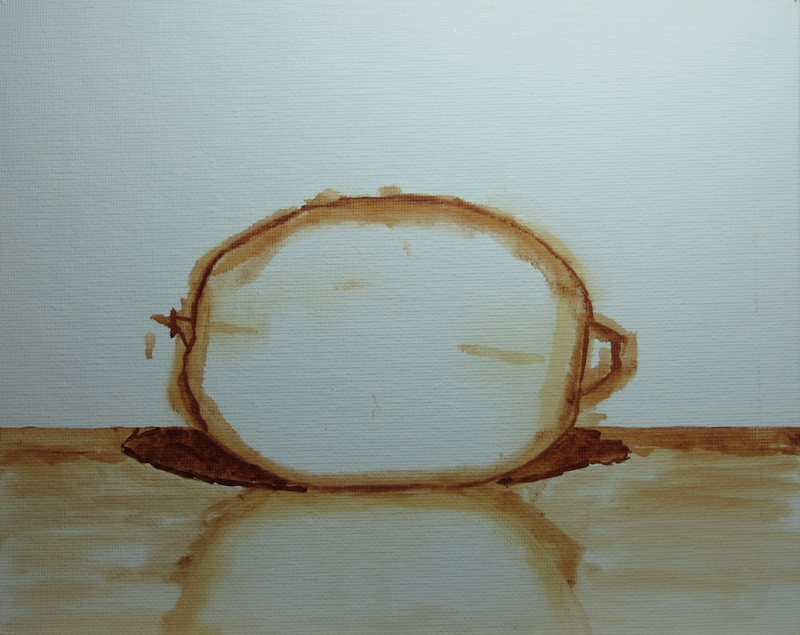
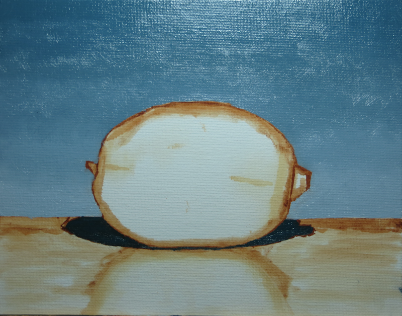
Here’s the initial sketch done in about 15 minutes in Burnt Sienna diluted with Gamsol.

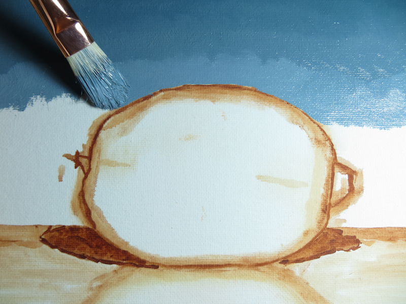
I’m getting better at doing gradients. This one was based on a string of 5 values, which, with pairwise combinations made a scale with nine steps. I applied the paint first, and then went back to smooth out the gradient.

This is where I stopped after about an hour’s work.

Edges in Shadow

During today’s crit, Gary gave me a lesson in softening edges that are deep in shadow.

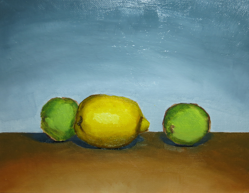
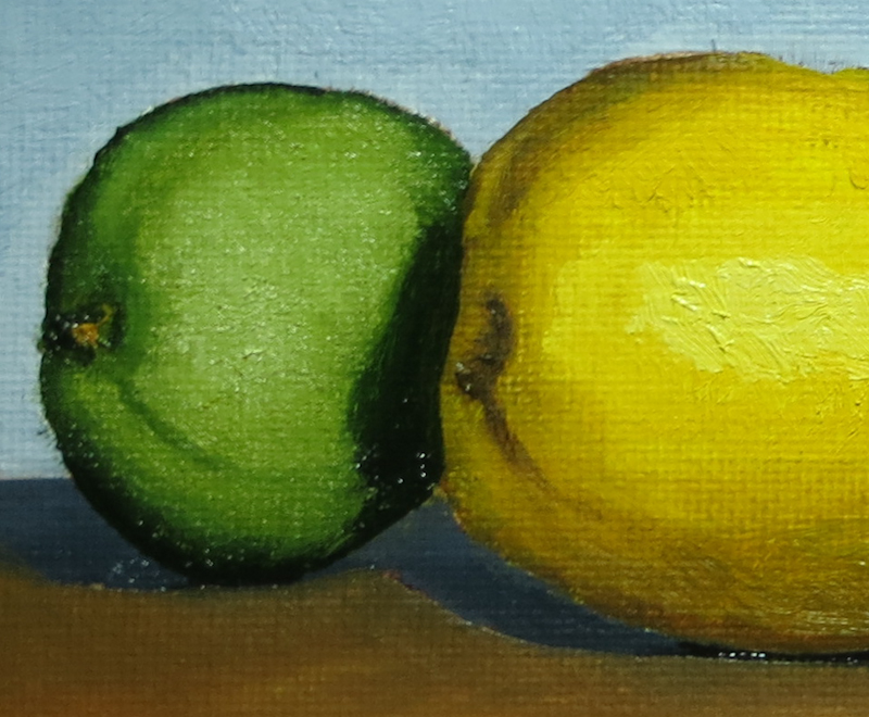
This is my original painting. Notice that the left edge of the lemon is sharp and fairly high contrast where it passes in front of the lime.

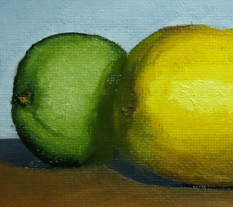
Gary picked up a small bristle brush and worked in some green, dark yellow and brown until the edge of the lime was almost lost in the darkness of the shadow.

February 4, 2014

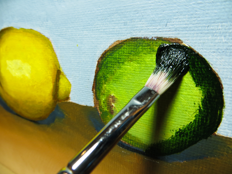
Tonight I worked on the limes. Gary had demonstrated his technique for rendering front-lit forms, which was to start with the darkest color and place it around the edges, and even completely across the form. This very flat, two-dimensional lime, then gets volume as successively lighter colors are blended into smaller concentric regions on top. Gary says to think of “sculpting” the object by building up the nearer portions with successive layers of lighter paint.

I started with the darkest color first. Darker pigments tend to be transparent, while the lighter pigments tend to be opaque. It is easy to lighten up a dark or even cover it with a light, but it is hard to go the other way.

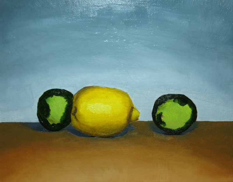
After adding the darkest value.

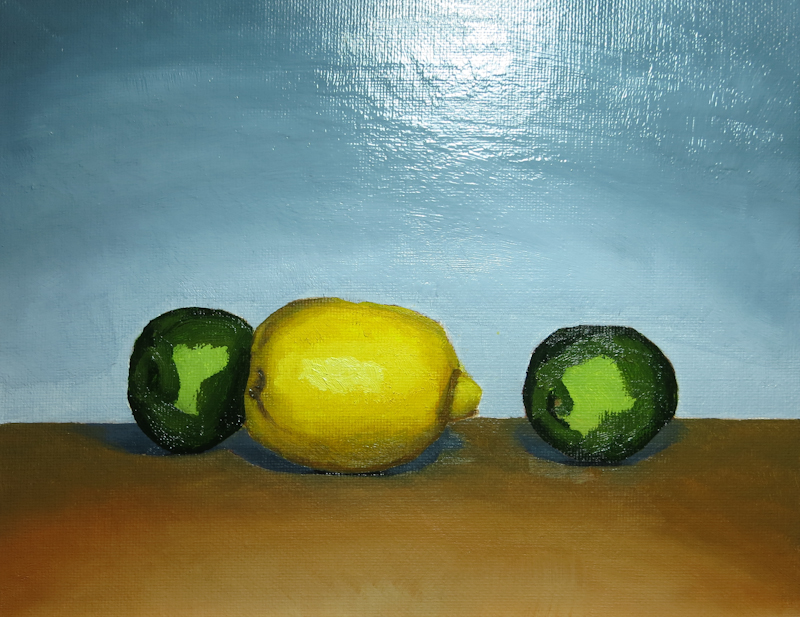
Here I’ve added the second value, but I haven’t done any blending.

Now I have three values, but still no blending.

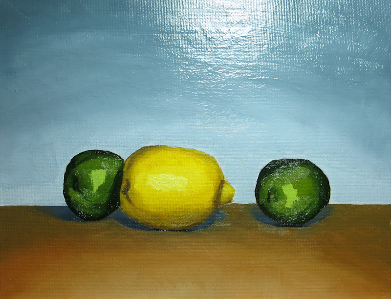
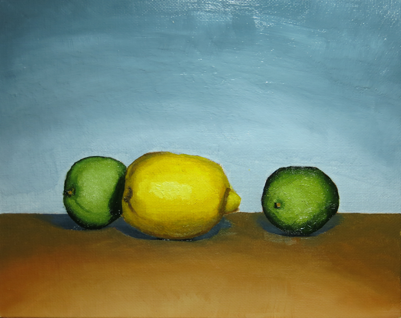
By this point, I’ve added all of the values and done quite a bit of blending to bring out the three-dimensional form. I found that I had to go quite a bit lighter than I had originally anticipated, and that the best way to apply the paint was dabbing with the brush almost perpendicular to the canvas.

January 30, 2014

On Thursday I began to shade in the form of the lemon. It took me a long time to mix up a string of yellows that didn’t head towards green in the darker values. I was really hoping to move towards an almost neutral, slightly yellow gray, but my darker values always seemed more brown than gray.

I used Cadmium Yellow Medium and Titanium White for the lightest step. The darker steps were made from the same yellow, mixed with Burnt Umber, Burnt Sienna, and Ultramarine Blue. My basic approach was to mix Yellow, Burnt Umber, and Ultramarine until I got the right value, then push it away from green, using either the Burnt Sienna or the Burnt Umber. If I went too far and it started looking like a reddish brown, I would add Ultramarine to pull it back towards a neutral.

This scene uses frontal lighting, so most of the darker values are only visible around the perimeters of the lemon and the limes. I like the modeling on the lemon, but need to work on the shape a bit, particularly on the lower left. The next step is the limes.