Redo with Aquatint

This evening, I made a second plate using an aquatint screen. The second plate has more subtle texture and variation in the line widths and does not produce lines with open bite.

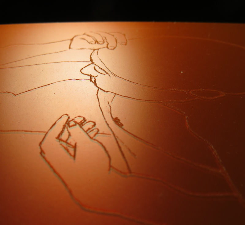
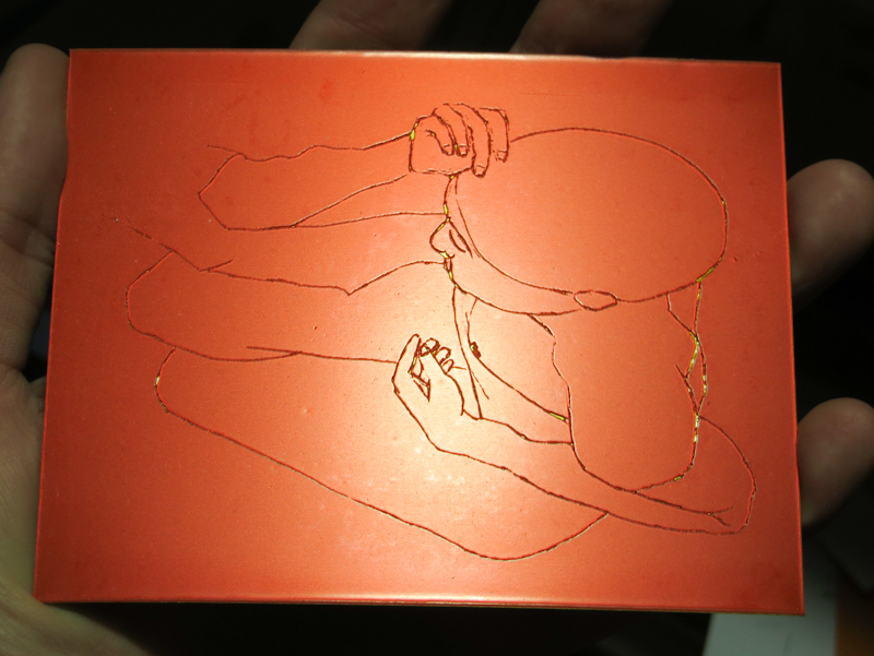
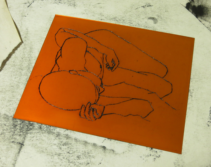
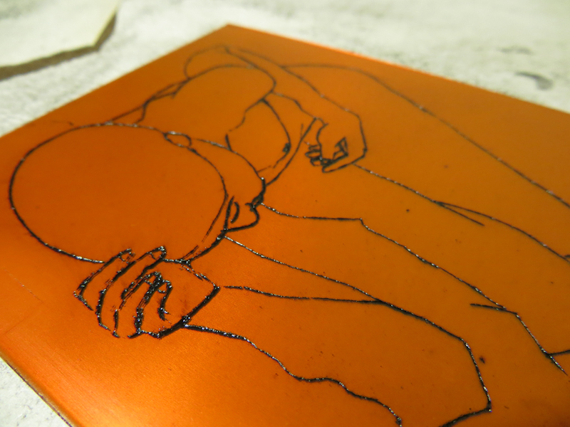
Here’s the second plate. This plate was exposed first with an aquatint screen and then a second time with the artwork. In this plate, the lines are made up of microscopic pits, instead of open grooves.

The plate with aquatint shows more subtle variation in the line widths.

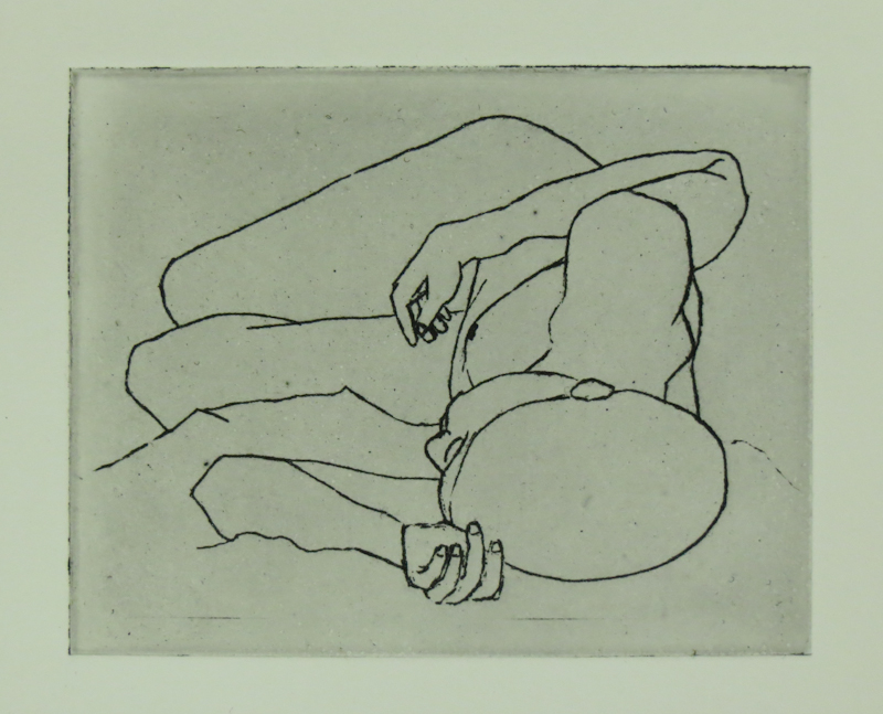
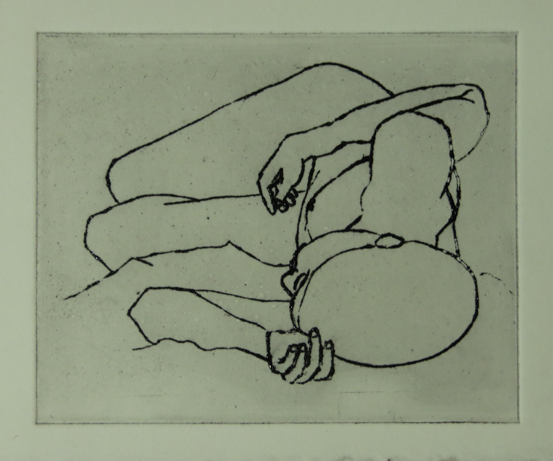
For comparision, here is the original artwork, the print from the aquatint plate, and the print from the first plate.

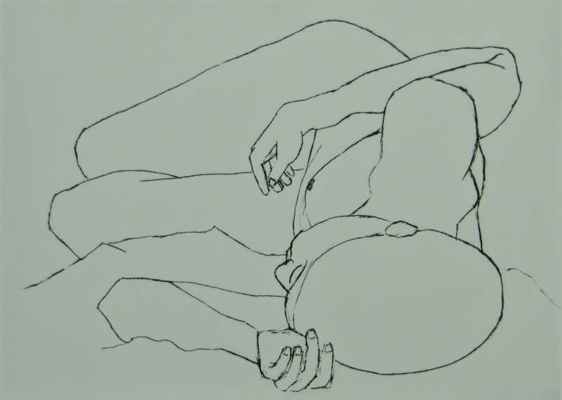
This is the artwork that I used for the plate exposure. My goal is for the prints to match the original artwork as closely as possible.

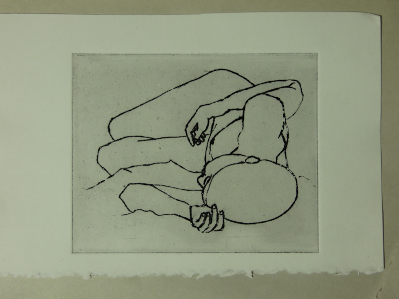
The second plate makes use of aquatint. Here there is a greater variation in line width and all lines print without open bite.

This print is from the first plate. That plate didn’t use aquatint and may have been over-etched, resulting in open bite and thicker lines.

Starting a New Print

I just made an intaglio print based on one of my favorite line drawings. The original charcoal drawing is from my time in Geoff Flack’s Foundation Figure Drawing course back in 2010. I made the plate last night from a piece of SolarPlate. The results were decent for a first attempt, but I think in the end I failed to capture the subtlety of the line drawing. My next attempt will be an aquatint, which hopefully will more accurately reproduce the softness in the charcoal lines.

This photopolymer plate works like a classical etching in copper, where the grooves hold the ink and the smooth surface is wiped clean. I’m concerned that I will get open bite in the shoulder area because the lines are too wide. Open bite happens when the groove is so wide that the capillary forces in the ink are unable to hold the ink in place as the plate is wiped. I’m still investigating why the lines in the shoulder are so thick. It could be the original artwork, or I may have over developed the plate.

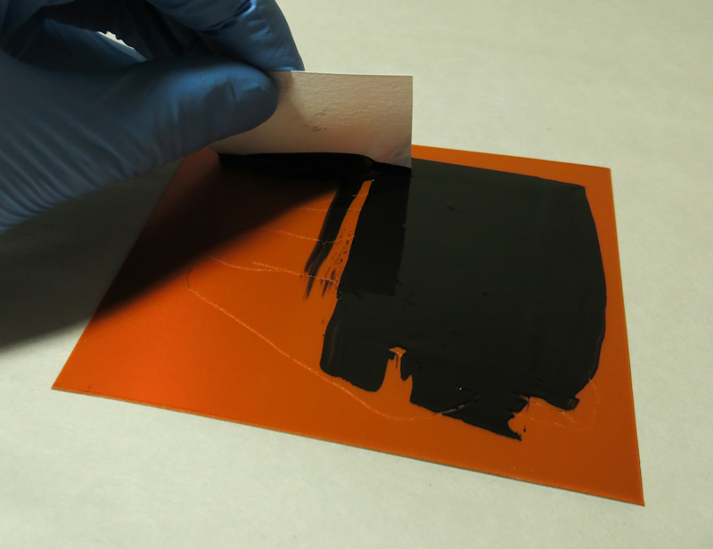
The first step in printing intaglio is to apply ink to the plate. I like to use a scrap of cardstock to help push the ink into all of the grooves.

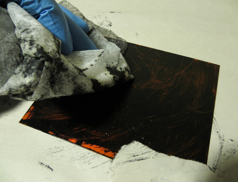
Here I’m starting to wipe the plate with a piece of tarlatan (basically a piece of cheesecloth that has been heavily starched). The goal for this pass is to remove the heaviest ink deposits while grinding the ink into the lines.

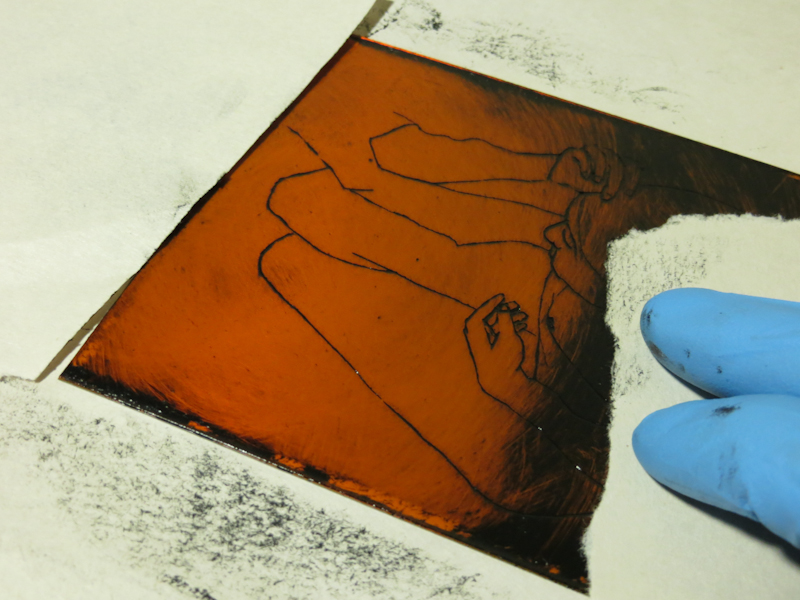
After removing the bulk of the ink with the tarlatan, I switch to newsprint which removes surface ink while leaving the lines. The newsprint also tends to polish the smoother parts of the plate.

At this point, I’ve wiped with tarlatan, then newsprint. All that remains is to clean up any ink that has stuck to the edges of the plate.

Here’s a close up of the plate immediately before printing. I’m a bit concerned that the fingernails are holding too much ink.

Here’s the first print, on a scrap of damp Rising Stonehenge. As I suspected, there is some open bite in the lines of the shoulder, and the lines in the fingers are not as subtle as the original artwork. The grey rectangle is called plate tone and is created by the residual ink on the plate. Plate tone is one of the hallmarks of the intaglio process. In this test print, I over-wiped the bottom of the plate, leading to uneven plate tone.

January 25, 2014

Today I painted the tabletop and the shadows of the fruit and then I reworked the background to have a sharper gradient. I still have a lot to learn about creating smooth gradients. My work on the background and the tabletop probably took twice as long as I had spent on the painting previously.

Not sure my changes improved the painting, mainly because the tabletop seems a bit dark. Tomorrow I will start painting the fruit.

Moving On

You’re probably wondering what happened to my Wine and Apples painting. I didn’t finish it to my satisfaction, but Gary and I agreed that I had reached the point of diminishing returns on learning to paint.

With that we declared the painting finished! What a relief! I took the painting off the easel, struck the set and moved on to Limes and Lemons.

Here are a few take-aways from my first atelier painting:

  1. The study and the underpainting seem to have more energy and personality than the finished painting.
  2. The parts that went quickly, like the initial drawing, the underpainting, the apples, and the cloth, were more satisfying and more compelling.
  3. Many of the passages where I struggled didn’t really contribute much to the success of the overall painting. Gary says these areas will improve as I get more experience.
  4. From a learning perspective, it is better to create more paintings than to endlessly rework a single painting.

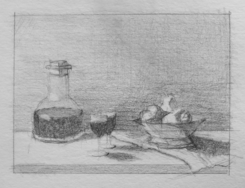
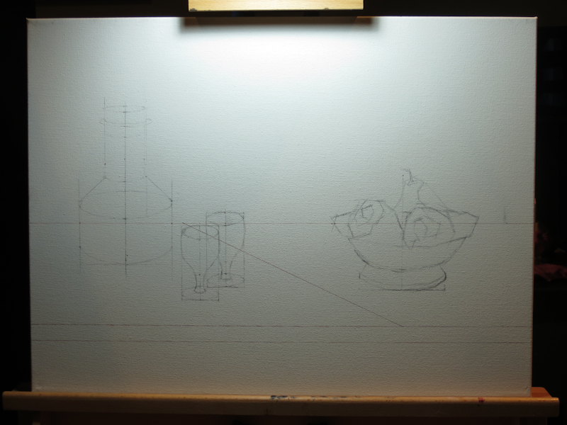
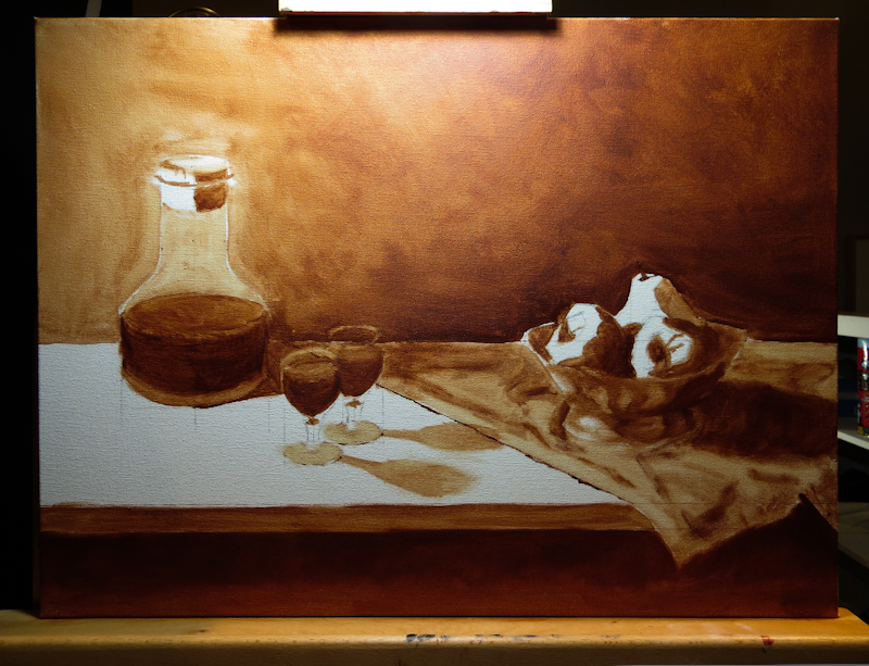
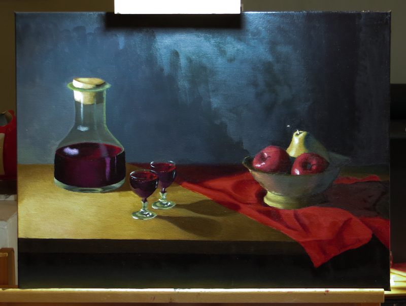
Here’s a recap of the stages of Wine and Apples:

The actors are on the stage.

Twenty minute value study in graphite, 3″ x 4″.

18″x24″ canvas with Indian Red Faber-Castell Pitt pen and vine charcoal.

18″x24″ under painting, burnt sienna on canvas.

The finished painting.

Limes and Lemons

Today I started on a new painting! Gary wants me to shoot for four paintings over the next month, so I am focusing on smaller sizes and simpler, less diverse subject matter. The idea is that I will learn more in a month from four simple paintings than an entire quarter spent on a one large and complex painting. This first study is on an 8″x10″ canvas panel.
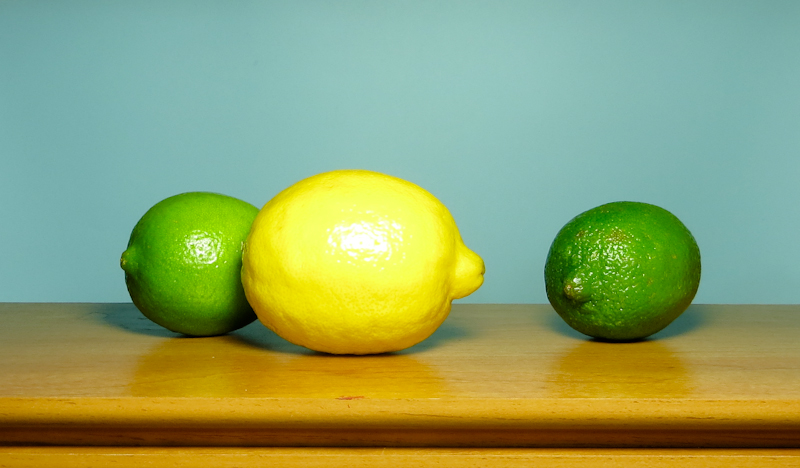
Here’s the tableau. After months of intense chiaroscuro, I wanted to do something high key with a lot of bright happy colors. Gary suggested citrus fruits since they don’t spoil too quickly and are fun to paint.
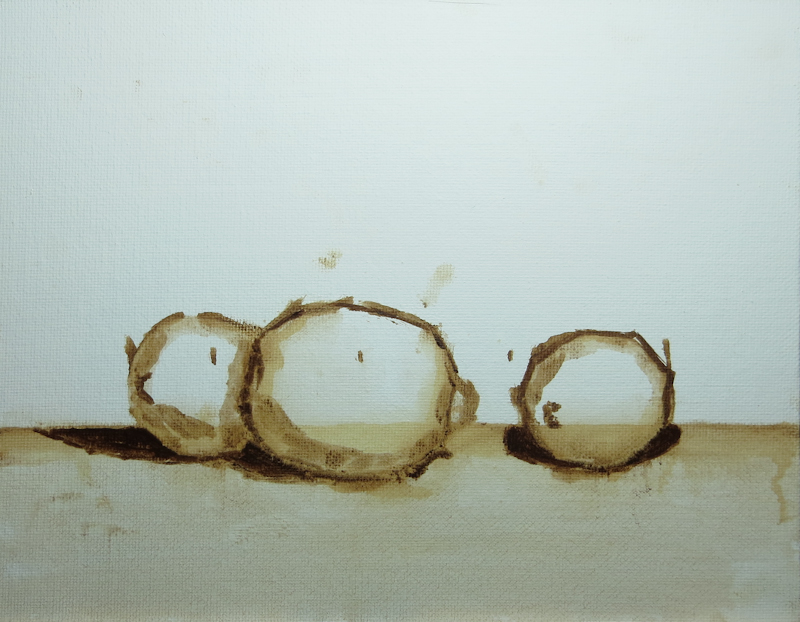
I did my initial drawing with a brush, using Burnt Umber diluted with Gamsol. My goal in using the brush, instead of charcoal, was to learn to draw directly in paint.
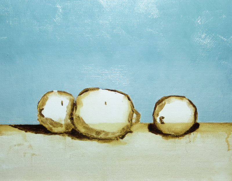
The background is a mixture of French Ultramarine, Cadmium Orange, Cadmium Yellow, and Titanium White. I think I did a pretty good job matching the color.

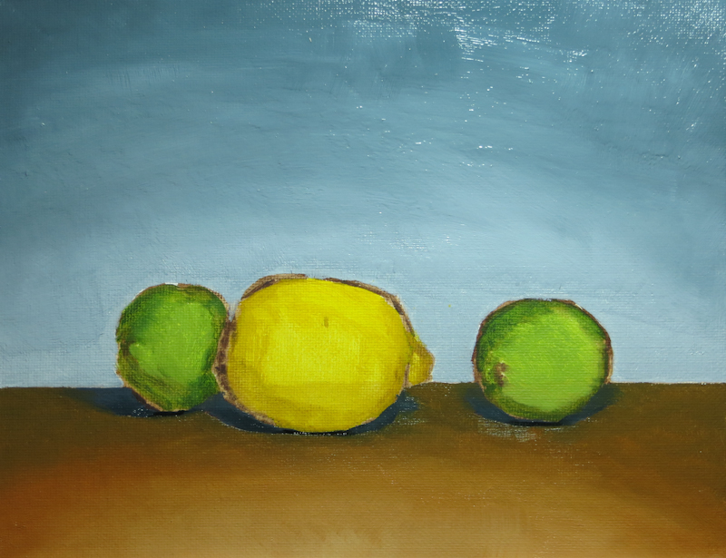
Here’s the painting at the end of the first session. It reminds me of a Cezanne because of the dark outlines around the fruit. Although I like Cezanne, my intention is to cover the dark outlines when I paint over the placeholder colors on the fruit.
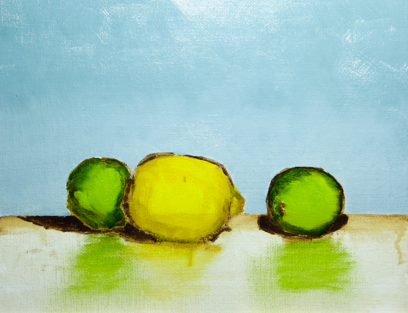
Before leaving for the day, I took 5 minutes to quickly brush in some diluted placeholder colors in order to get an idea of how the image was coming together. I used Cadmium Yellow Medium for the lemon and a mixture of Sap Green, French Ultramarine, and Cadmium Yellow Medium for the limes.
Back to Work

It’s been a while since my last post. With holiday travel, cooking and cards, there just wasn’t time to paint. Now I’m back and determined to finish this painting so I can start on something new!

At this point, I am adding finishing touches all over the painting, so I need a little bit of each color.

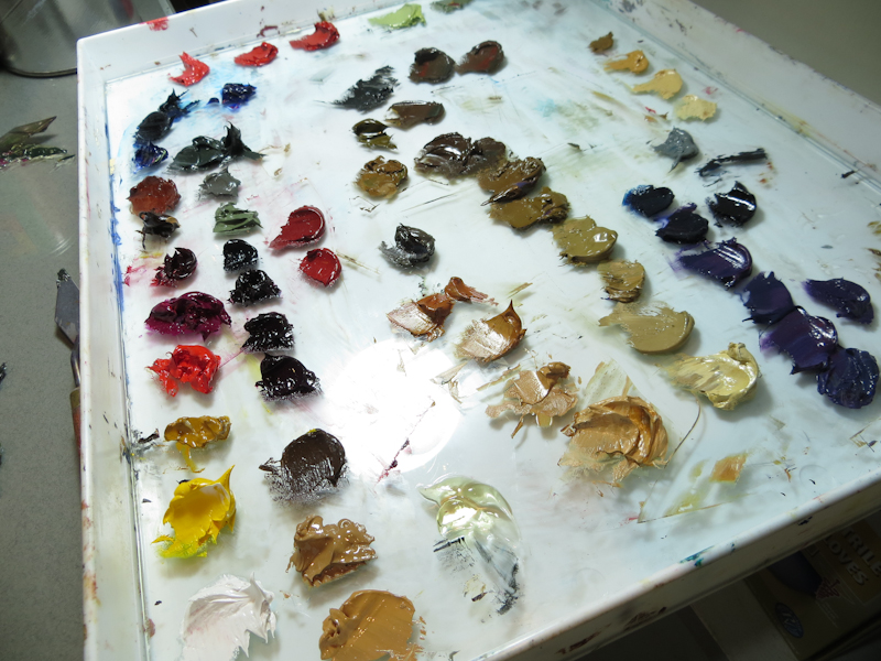
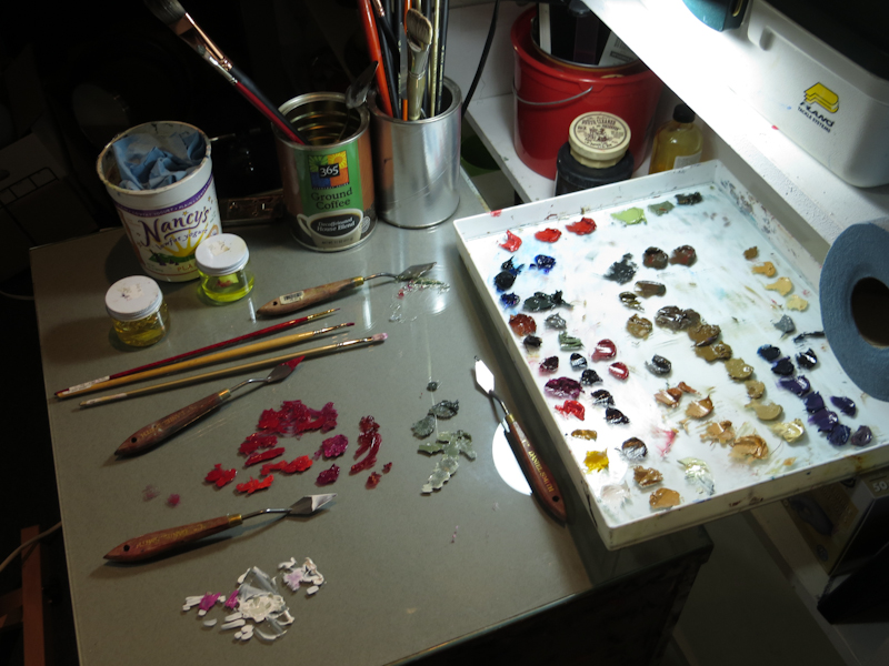
Over break I got a big piece of glass to work on. The large work area is a real joy, especially at this stage in the painting where I need to hop from place to place, using miniscule amounts of all of the colors.

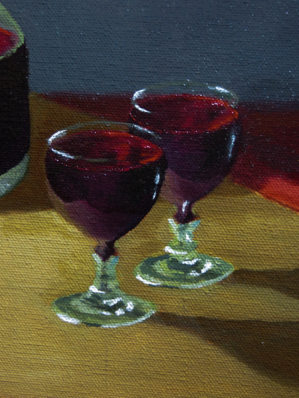
I think the reflections in the wine glasses turned out pretty well. I will probably knock the specular highlights down to a light gray and do a bit more work to adjust the shape of the base of the glass on the right.

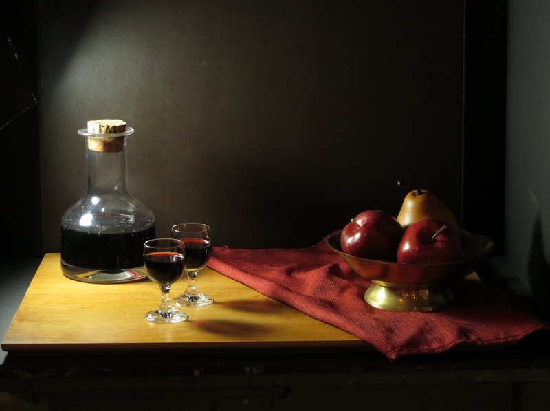
Here’s the painting at the end of the evening. I’m not happy with the reflections on the carafe, so I will probably rework it tomorrow. Note that the lower left half of the painting below the diagonal seems wet, while the upper right half is dry. Before I applied any paint, I “oiled out” the areas where I planned to work by applying a thin coat of medium, in this case Neo Megilp. Oiling out gives a uniform working surface and assists in blending.