Here’s another pear composition idea. It is amazing how few visual cues one actually needs to understand a scene.


Here’s another pear composition idea. It is amazing how few visual cues one actually needs to understand a scene.
I went back and did a gouache study of the three-pear composition in my linocut and it came out much better after adding some subtle curvature cues and cleaning up the edge contours. Time for another linoleum carving session!

I’ve been having so much fun with the linocut prints that I pitched the idea as a family Thanksgiving activity. We all spent the afternoon listening to music, nibbling on appetizers and taking occasional breaks to carve our blocks and pull prints. I did this quick study of pears intended for a holiday card. The idea has promise, but I’m not really sold on the bits of light creeping around the right side of the middle and right pears. Next time I will do a gouache study before carving the block.
Printing notes: the proof below is actually on newsprint which performed better than the Daniel Smith Lennox paper. I went back and looked at my pumpkin print on Lennox and found that it suffered from the same problems I encountered with the pear – the ink sits high on the surface and it flows around, obscurring fine detail.

Pear Ensemble, Linocut Print, 4″ x 5″
I love the negative space in this watercolor by Susan Booth Titus.

Cornfield, Susan Booth Titus
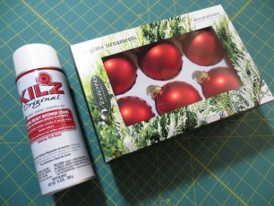
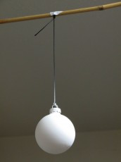
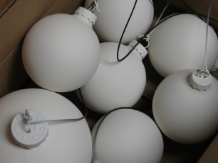
This week we started to render white spheres in charcoal. The timing couldn’t have been better because Christmas ornaments just went on sale at Bartells. Christmas ornaments make excellent drawing spheres because:
Here are some painting tips:
Today I experimented with papers designed specially for block printing and had much better success.

Better paper makes a world of difference.
I used Dick Blick water soluble printing ink on five different papers. Here are the results:
Overall, it seems that thinner papers with a nappy surface work the best.

Five prints on five different papers.
People have asked me how I got the dramatic shadows in the pumpkin notans. The key was to use a very small, almost point source light at a distance and eliminate ambient room light. I used an LED headlamp about 6 feet away from the pumpkins. The LED headlamp is a great light source for chiaroscuro because it has only a single LED and it is pretty bright, even at a distance. By turning off the room lights, I was able to eliminate most ambient light and this intensified the blacks of the shadows.
I found the most successful arrangements where those where the subject was mostly backlit, with a bit of intense light peeking around the edge. Once the light is positioned, it helps to choose a background that contrasts with the lighting on the subject. I often used a split background with white to accentuate the edges in shadow and black to bring out the illuminated edges.
When working with dramatic lighting, the room tends to get pretty dark so you either need to work from photos or use one of those clip-on booklights on your drawing board.

An LED headlamp in a darkened room makes dramatic shadows.
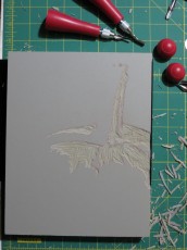
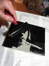
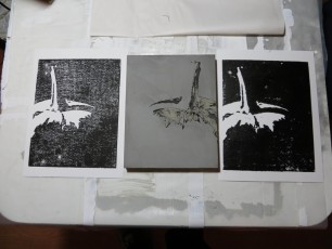
The pumpkin notans were so successful I decided to reproduce them as linoleum block prints. I haven’t done this sort of a project since elementary school, but the block cutting went well. I pulled two test prints by hand using a baren and was pretty happy with the block, but still need to sort out the ink and paper combination so that I get solid blacks. My first print showed good detail, but the ink transfer was poor. I used a lot more ink on the second print and this helped the blacks, but I lost a bit of detail. Both prints were made with Dick Blick water soluble printing ink on Strathmore 300 Bristol Vellum. I’ve heard that oil based inks work better on cotton fiber papers, and that water soluble inks are better on Japanese rice papers. I also suspect that a thinner paper would take the ink better than the Bristol.
Mandy Hallenius has put together some fantastic lesson plans for teaching classical drawing in a K-12 art classes. She currently has four lessons available for download. Check them out.
Over the weekend I did this small three-value study of Lake Keechelus.
